Solution proposal - week 8
Solutions to exercises week 8
INF2310, spring 2017
Task 1 (Problem 6.5 in G&W)

At position we have the color
That is, gray plus green, which equals a bright green
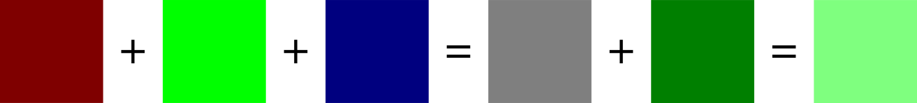
Compare this to saturated green
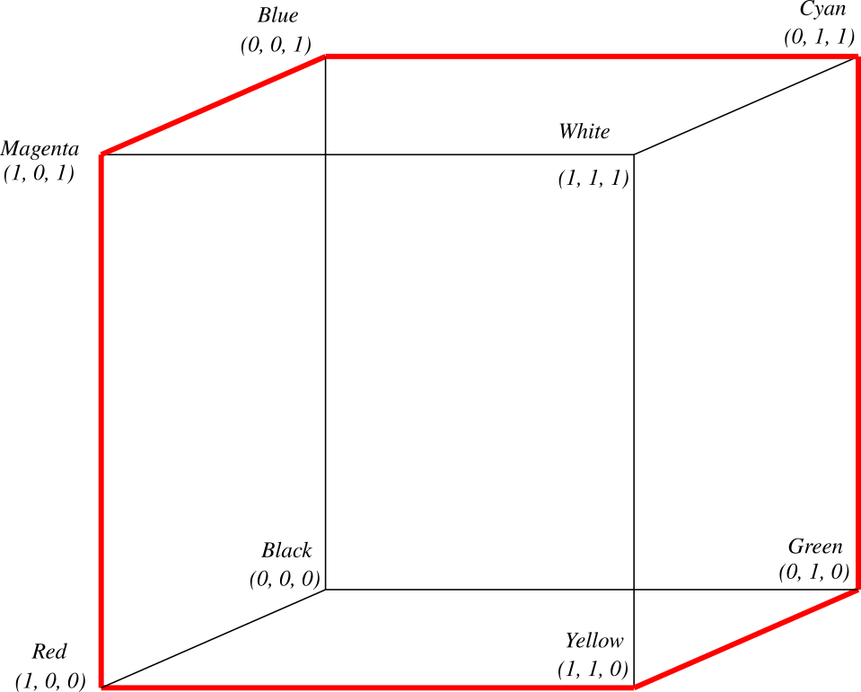
Task 2 (Problem 6.6 in G&W)
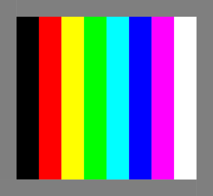
The colors in fig. 3 has maximal saturation and intensity, and the gray is in the middle between black and white. We then get the following table for the RGB-component values.
| Color | R | G | B | Mono R | Mono G | Mono B |
|---|---|---|---|---|---|---|
| Gray | 0.5 | 0.5 | 0.5 | 128 | 128 | 128 |
| Black | 0 | 0 | 0 | 0 | 0 | 0 |
| Red | 1 | 0 | 0 | 255 | 0 | 0 |
| Yellow | 1 | 1 | 0 | 255 | 255 | 0 |
| Green | 0 | 1 | 0 | 0 | 255 | 0 |
| Cyan | 0 | 1 | 1 | 0 | 255 | 255 |
| Blue | 0 | 0 | 1 | 0 | 0 | 255 |
| Magenta | 1 | 0 | 1 | 255 | 0 | 255 |
| White | 1 | 1 | 1 | 255 | 255 | 255 |
Task 3 (Problem 6.7 in G&W)
There is 256 possible values in each of the three 8-bit channels. In order for each pixel to be a pure gray-level, the three RGB components must be equal. Therefore it is only 256 graylevels. If we had used e.g. 5, 5, and 6, bits for the different components, we would only get () graylevels, and not ().
Task 4
Proposed solution in python
%matplotlib inline

import cv2
import matplotlib.pyplot as plt
import numpy as np
import seaborn
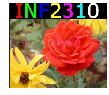
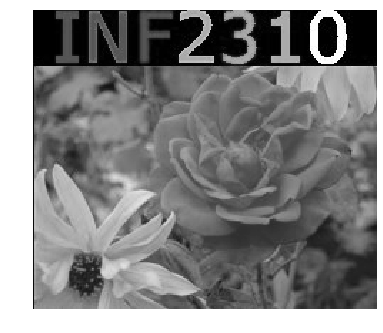
im_rgb = cv2.cvtColor(cv2.imread('../../assets/images/rose_rgb.png', cv2.IMREAD_COLOR), cv2.COLOR_BGR2RGB)

plt.imshow(im_rgb)
plt.axis('off')
a)
If we print the shape of the image, we see that the channels are stored at different “depths” in the image. The intensity component of a HSI image is the average of the intensities in the R, G, and B channels.
print(im_rgb.shape)
print(np.min(im_rgb), np.max(im_rgb))

    (210, 241, 3)
    0 255
R, G, B = np.squeeze(np.dsplit(im_rgb.astype(np.float32), 3)) # Squeeze removes redundant dimensions
I = np.round((R + G + B) / 3.).astype(np.uint8)
plt.figure(0)
plt.imshow(I, cmap='gray')
plt.axis('off')
b)
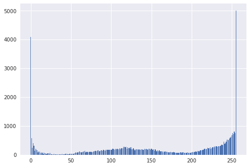
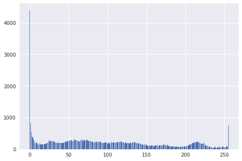
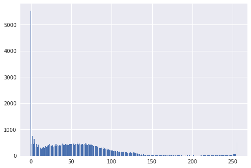
The histograms are as follows
r_hist, _ = np.histogram(R.ravel(), 255, range=(0, 255))

plt.figure(1)
plt.bar(np.linspace(0, 255, 255), r_hist)
g_hist, _ = np.histogram(G.ravel(), 255, range=(0, 255))

plt.figure(2)
plt.bar(np.linspace(0, 255, 255), g_hist)
b_hist, _ = np.histogram(B.ravel(), 255, range=(0, 255))

plt.figure(3)
plt.bar(np.linspace(0, 255, 255), b_hist)
i_hist, _ = np.histogram(I.ravel(), 255, range=(0, 255))

plt.figure(2)
plt.bar(np.linspace(0, 255, 255), i_hist)
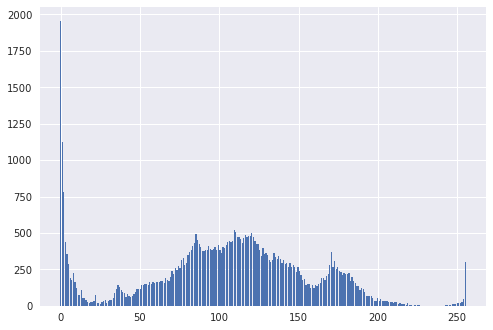
Let (where ) be our images, taking values in . Then, at level , the respective histograms has the value
where [ ] is the Iverson bracket. If we expand the expression for the intensity histogram, we get
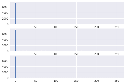
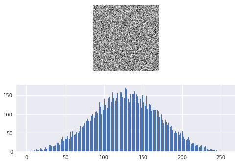
and evidently, it is very many combinations of R, G, and B that can give a certain value . It is therefore difficult to predict how the resulting intensity histogram will look like, as we have seen demonstrated above. It tempting to conclude that since 0 is the dominating intensity level in all color component histograms, it is also dominating the intensity histogram, (as is the case for us), but it is easy to construct a counter-example to demonstrate that this is not so. Rather, in the case of random noise distributed uniformly at the image, we should expect a bell-shaped intensity histogram with highest values at the middle levels (around 127, 128), and decreasing in both directions towards 0 and 255.
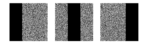
# Construct 3 random color channels, with 1/3 black pixels ad non-overlapping positions
A = np.random.randint(1, 255, (150, 150))
B = np.random.randint(1, 255, (150, 150))
C = np.random.randint(1, 255, (150, 150))
A[:, 0:50] = 0
B[:, 50:100] = 0
C[:, 100:150] = 0

_, (ax1, ax2, ax3) = plt.subplots(1, 3)
ax1.imshow(A, cmap='gray')
ax1.axis('off')
ax2.imshow(B, cmap='gray')
ax2.axis('off')
ax3.imshow(C, cmap='gray')
ax3.axis('off')
a_hist, _ = np.histogram(A.ravel(), 255, range=(0, 255))
b_hist, _ = np.histogram(B.ravel(), 255, range=(0, 255))
c_hist, _ = np.histogram(C.ravel(), 255, range=(0, 255))

_, (ax1, ax2, ax3) = plt.subplots(3, 1)
ax1.bar(np.linspace(0, 255, 255), a_hist)
ax2.bar(np.linspace(0, 255, 255), b_hist)
ax3.bar(np.linspace(0, 255, 255), c_hist)
I = np.round((A + B + C) / 3).astype(np.uint8)
i_hist, _ = np.histogram(I.ravel(), 255, range=(0, 255))
_, (ax1, ax2) = plt.subplots(2, 1)
ax1.imshow(I)
ax1.axis('off')
ax2.bar(np.linspace(0, 255, 255), i_hist)
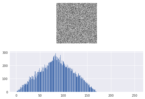
# Example of average of uniform noise
R1 = np.random.randint(0, 255, (128, 128))
R2 = np.random.randint(0, 255, (128, 128))
R3 = np.random.randint(0, 255, (128, 128))
R = np.round((R1 + R2 + R3) / 3).astype(np.uint8)
r_hist, _ = np.histogram(R.ravel(), 255, range=(0, 255))
_, (ax1, ax2) = plt.subplots(2, 1)
ax1.imshow(R)
ax1.axis('off')
ax2.bar(np.linspace(0, 255, 255), r_hist)
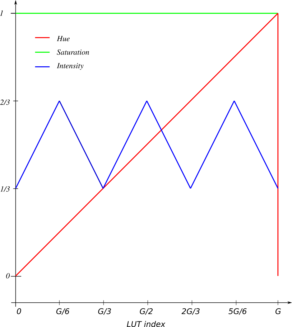
Task 5
An 8-bit graylevel image (with 256 graylevels) is shown with a RGB pseudo color look up table, where the R, G, B components are as shown in the figure.
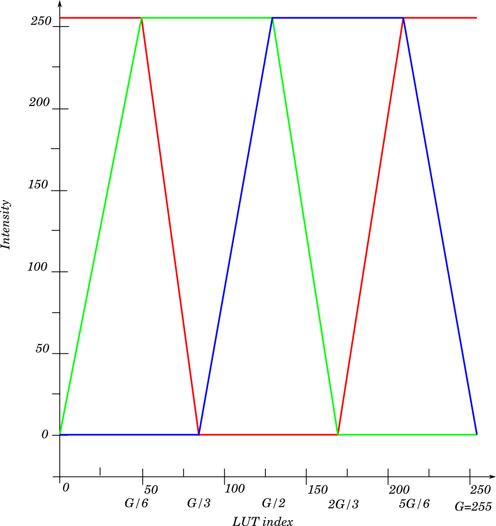
a)
Index will be shown as yellow because there is maximal levels of red and green, and no blue.
b)
At blue is at max with no red and green, therefore the resulting color is blue.
c)
It will be as a color-circle, red yellow green cyan blue magenta red.
d)
e)
The saturation is fixed at maximum value , and you will see that the color, given by the hue channel will increase linearly. The intensity value will oscilate linearly between and . This is illustrated in fig. 6.